
鸿蒙HarmonyOS 4-ArkUI组件
Image:图片显示组件
- 声明Image组件并设置图片源:
1
Image(src: string|PixelMap|Resource)
- string格式,通常用来加载网络图片,需要申请网络访问权限:ohos.permission.INTERNET
Image('https://xxx.png')
需要网络权限,在module.json5配置文件中声明权限。1
2
3
4
5"requestPermissions": [
{
"name": "ohos.permission.INTERNET"
}
] - PixelMap格式,可以加载像素图,通常用在图片编辑中
Image(pixelMapObject) - Resource格式,加载本地图片,推荐使用
Image($r('app.media.xxx')Image($rawfile('xxx.png'))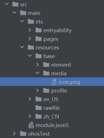
- 添加图片属性图片插值可以让图片锯齿变小
1
2
3
4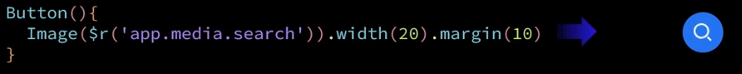
5Image($r('app.media.icon'))
.width(100) //宽度
.height(120) //高度
.borderRadius(10) //边框圆角
.interpolation(ImageInterpolation.High) //图片插值
Text:文本显示组件
- 声明Text组件并设置文本内容
1
Text(content?:string|Resource)
- string格式,直接填写文本内容
Text('图片宽度') - Resource格式,读取本地资源文件
Text($r('app.string.width_label'))
可以实现显示不同国家语言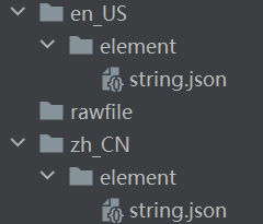
1
2
3
4
5
6
7
8{
"string": [
{
"name": "width_label",
"value": "图片宽度:"
}
]
}
- 添加文本属性
1
2
3
4
5Text('注册账号')
.lineHeight(32) //行高
.fontSize(20) //字体大小
.fontColor('#ff1876f8') //字体颜色
.fontWeight(FontWeight.Medium) //字体粗细
TextInput:文本输入框
- 声明TextInput组件:
1
TextInput( {placeholder?: ResourceStr, text?: ResourceStr})
- placeHoler:输入框提示文本
TextInput({placeholer: '请输入手机号'}) - text:输入框默认的文本内容
TextInput({text: 'xxx'})
- 添加属性和事件
1
2
3
4
5
6
7
8TextInput({text: '当前输入文本'})
.width(150) //宽
.height(30) //高
.backgroundColor('#FFF') //背景色
.type(InputType.Password) //输入框类型,密码输入框
.onChange(value => { //事件处理
//value是用户输入的文本内容
})
| 名称 | 描述 |
|---|---|
| Normal | 基本输入模式 |
| Password | 密码输入模式 |
| 邮箱地址输入模式 | |
| Number | 纯数字输入模式 |
| PhoneNumber | 电话号码输入模式 |
Button:按钮组件
- 声明Button组件,label是按钮文字:
1
Button(label?: ResourceStr)
- 文字型按钮
Button('点击') - 自定义按钮,在button内嵌套其他组件
- 添加属性和事件
1
2
3
4
5
6
7Button('点击')
.width(100)
.height(30)
.type(ButtonType.Normal)
.onClick(() => {
//处理点击事件
})
| 名称 | 描述 |
|---|---|
| Capsule | 胶囊型按钮 |
| Circle | 圆形按钮 |
| Normal | 普通按钮 |
Slider:滑动条组件
1 | Silder(options?: SliderOptions) |

1 | Slider({ |
Column & Row:线性布局组件
- Column为纵向布局,Row为横向布局
1
2
3
4
5
6
7
8
9
10
11Column({space: 20}){
Text('123')
Text('ABC')
Text('XYZ')
}
.width('100%')
.height('100%')
.padding(20)
.justifyContent(FlexAlign.Center)
.alignItems(HorizontalAlign.Center)
} - justifyContent:设置子元素在主轴方向的对齐格式
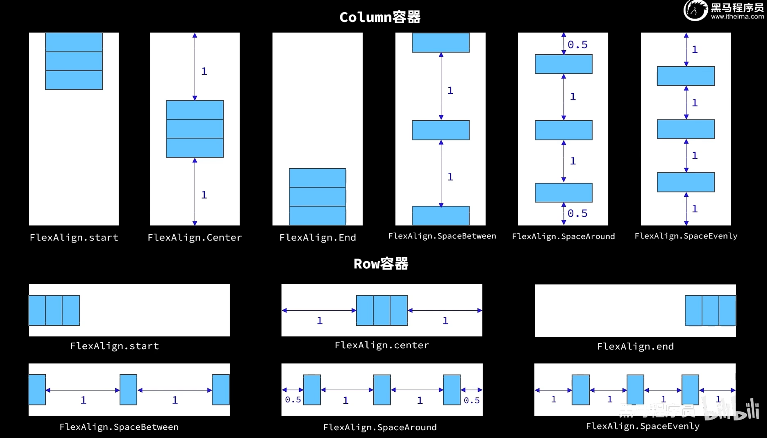
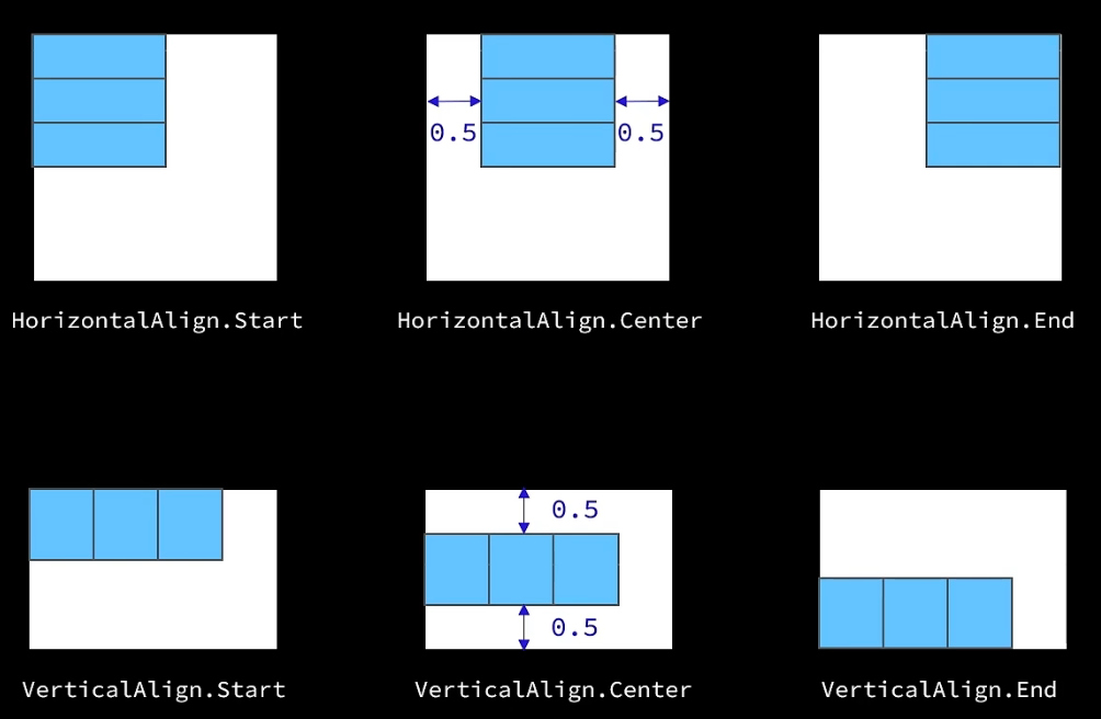
- alignItems:设置子元素在交叉轴方向的对齐格式
- padding:内边距,边框距离元素的距离
1
2
3
4Row(){
}
.padding({left: 14, right: 14}) //左右内边距 - margin:外边距
1
2
3
4Column(){
}
.margin({top: 35, bottom: 35}) //上下外边距 - Divider:分割线
1
2Divider()
.width('90%')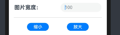
- layoutWeight:权重分配,默认为0,则为原定的高度。如果为其他为0,这个元素为1,则除了另外元素的空间,全部分配给权重为1的元素。
1
2
3row(){
}
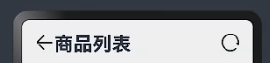
.layourWeight(1) - Blank:将剩余的空间撑满
1
2
3
4
5
6Row(){
Image(/*返回图标*/)
Text('商品列表')
Blank()
Image(/*刷新图标*/)
}
循环控制
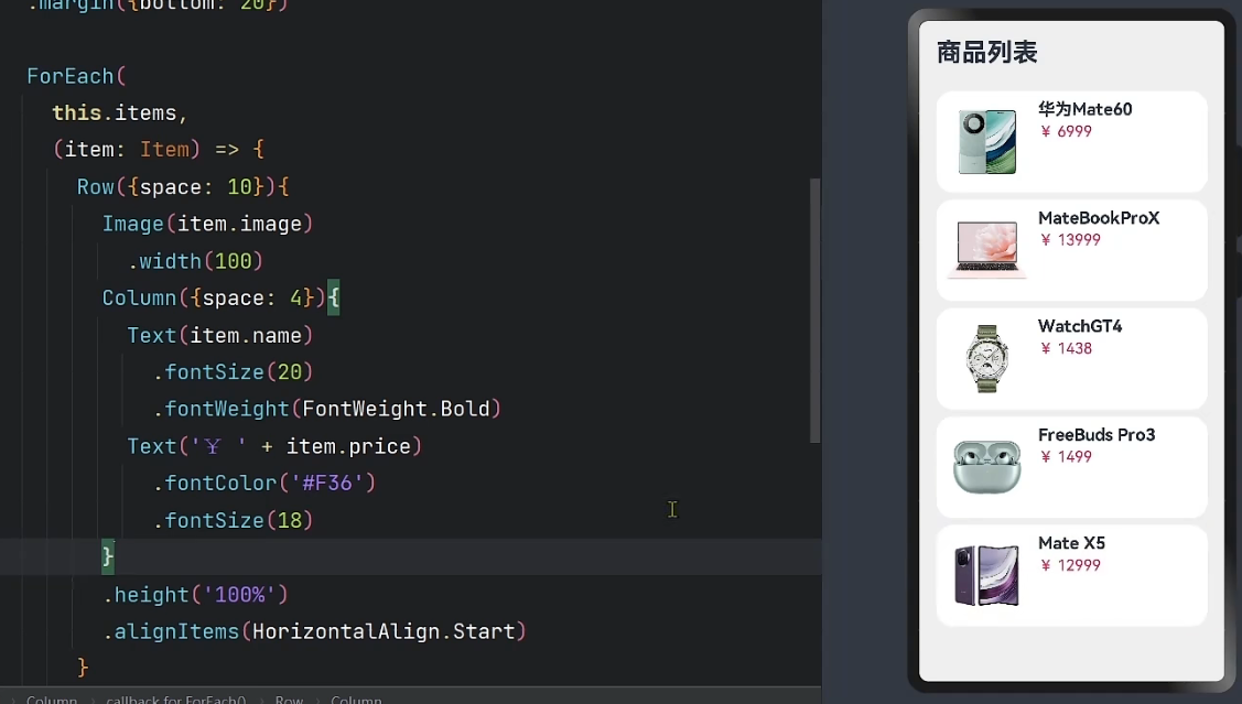
ForEach
- 循环遍历数组,根据数组内容渲染页面组件
1
2
3
4
5
6
7
8
9
10
11
12
13ForEach(
arr: Array, //要遍历的数据数组
(item: any, index?: number) => {
//页面组件生成函数
Row(){
Image(item.image)
//...
}
},
keyGenerator?: (item: any, index?: number): string => {
//键生成函数,为数组每一项生成一个唯一标示,组件是否重新渲染的判断标准
}
)
if / else
- 条件控制,根据数据状态的不同,渲染不同的页面组件
1
2
3
4
5
6if(/*判断条件*/){
//内容
}
else{
//内容
}
List:列表组件
- 列表(List)是一种复杂容器,具备下列特点:
- 列表项(ListItem)数量过多超出屏幕后,会自动提供滚动功能
- 列表项(ListItem)既可以纵向排列,也可以横向排列
1
2
3
4
5
6
7
8
9List({space: 10}){
ForEach([1, 2, 3, 4], item => {
ListItem(){
//列表项内容,只能包含一个根组件
}
})
}
.width('100%')
.listDirection(Axis.Vertical) //列表方向,默认纵向,横向为Horizontal
- space:和容器组件一样,表示列表项间距
- ListItem:是一种标记,不是容器,只能包含一个根组件
自定义组件
- 自定义组件
1
2
3
4
5
6
7
8
9
10
11
12
13
14
15
16
17
18
19
export struct Header {//export用于在不同文件时导出
private title: ResourceStr //参数
build(){
//组件内容
}
}
//可以直接使用
import {Header} from '相对地址' //用于不同文件时的导入
struct Page {
build(){
Header({title: '主页'}) //直接传入参数
}
} - 自定义构建函数
1
2
3
4
5
6
7
8
9
10
11
12
13
14
15
16
17//全局构建函数
function ItemCard(item: Item){
Row({space: 10}){
//组件内容
}
}
//调用
ItemCar(item)
//局部构建函数,不用写function
ItemCard(item: Item){
Row({space: 10}){
//组件内容
}
}
//调用
this.ItemCar(item) - 自定义公共样式
1
2
3
4
5
6
7
8
9
10
11
12
13//全局公共样式函数
function fillScreen(){
.width('100%')
//通用的样式
}
//调用
.fillScreen()
//局部公共样式只需要去掉function即可
//如果不是公共的属性,则使用继承模式,只能写在全局
(Text) function priceText(){ //Extend继承Text的属性
}
评论